The morning light hits the kitchen counter, catching the steam rising from your teacup. Beside the toast rack sits a jar of orange marmalade. You expect the reassuring weight of dimpled glass, a label steeped in faux-Victorian cursive, and perhaps a crest assuring you of its domestic pedigree. It is a sensory anchor, as reliable as the damp British winter.
Yet, reaching for your favourite brand this week, your hand hesitates. The familiar tartan and parchment aesthetics have vanished entirely. In their place sits a stark, flatly coloured cylinder boasting sans-serif typography. It looks less like a breakfast staple and more like an expensive Scandinavian face cream.
Across the country, shoppers are staring at supermarket shelves with genuine resentment. The sudden visual rebranding of classic marmalades feels like a quiet theft of morning comfort. It is jarring to see a product deeply tied to local nostalgia suddenly stripped of its warmth.
This disruption is far from accidental. Following recent border shifts and shifting export demands, makers are forced to recalibrate their entire visual identity to survive on international shelves. The quaint British jar simply doesn’t translate, and the supply chain for heavy, bespoke glass has become prohibitively expensive.
The Aesthetics of Bitter Truth
We tend to eat with our memories first. When you see a label featuring a thatched cottage or a fictitious grandmother, your brain primes your palate for authenticity. The old packaging acted like a heavy woollen blanket, wrapping the preserve in a comforting, uncritical warmth.
Stripping away that nostalgia feels like a betrayal, but it forces a profound shift in how you consume. Without the crutch of heritage marketing, the maker has nowhere to hide a mediocre set or a weak fruit ratio.
Think of it like taking a well-worn painting out of an ornate, distracting frame. The flaws in the brushwork are suddenly glaring, but the true brilliance of the colour also commands the room. By abandoning the heritage disguise, producers are suddenly entirely accountable to the sharpness of the peel and the clarity of the jelly.
This controversial post-Brexit rebranding is actually handing you a massive consumer advantage. You are no longer paying a premium for a quaint piece of paper; you are paying strictly for what is trapped beneath the lid.
Arthur Penhaligon, 62, a third-generation citrus buyer based in Dundee, has watched this unfold from the factory floor. Sitting in an office overlooking a yard of empty pallets, he rolls a sleek, freshly branded jar across his desk. “For decades, we sold the illusion of a sleepy country kitchen,” he says, adjusting his spectacles. “Now, the export markets demand clean lines, and the domestic glass tariffs are punishing. People are angry about the labels, but honestly? It’s the best thing that could happen to the recipe. They actually have to taste the Seville now.”
Arthur’s reality highlights a distinct pivot. The focus has moved entirely from container to the contents, leaving nostalgic marketing behind to ensure the actual preserve survives a brutal global market.
Adjusting to the Modern Preserve
Facing the newly modernised supermarket aisle requires a slight adjustment in how you shop. Without the visual cues of yesteryear, categorising what sits on the shelf demands a sharper eye.
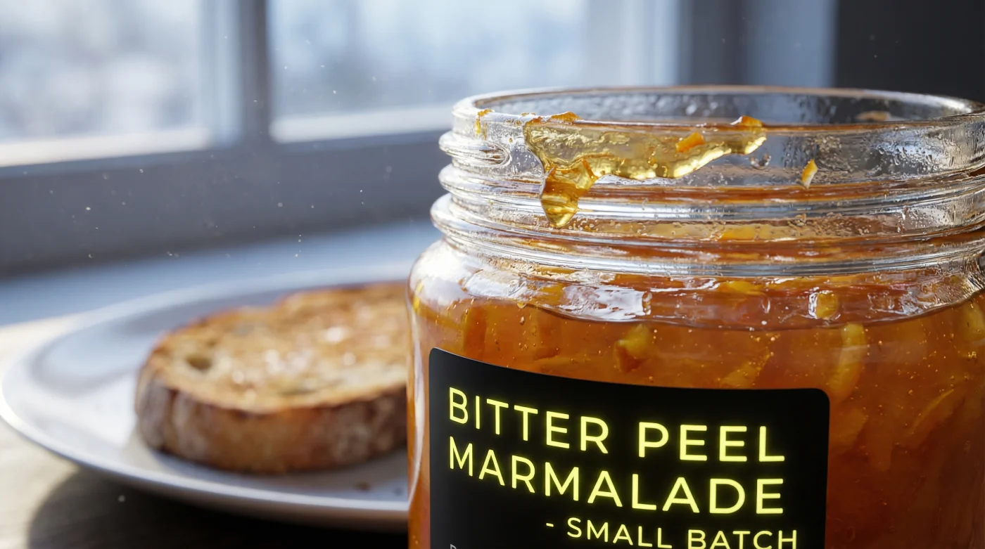
For the Purist: You are searching for the assertive bite of true Seville oranges. With modern packaging, ignore the minimalist branding and read the back label immediately. You want a fruit content of at least 30g per 100g, and the word ‘thick-cut’ must be earned by visible, suspended chunks of rind, not just pectin-heavy jelly.
For the Busy Household: Morning routines require a spread that behaves predictably. The new minimalist jars often hide ‘fine-cut’ or sweeter variants designed for broader international palates. These are less challenging, easier to spread on hastily buttered toast, and lack the aggressive bitterness that younger palates often reject.
- Dark chocolate seizes instantly when melted over vigorously boiling water baths.
- Bread dough achieves maximum fluffiness bypassing this exhausting traditional kneading process.
- Vanilla extract evaporates entirely when added to hot bubbling caramel sauces.
- Baking powder loses all lifting power undergoing this premature wet mixing.
- Brown butter transforms standard chocolate chip cookies requiring this constant swirling.
Navigating the Minimalist Aisle
Transitioning away from familiar visual comforts takes a moment of conscious recalibration. Rather than scanning for a specific crest or a familiar font, you must evaluate the actual substance inside the glass.
Hold the jar up to the light. The jelly should be a clear, brilliant amber, never murky. The peel should be suspended evenly throughout the jar, proving a masterfully timed setting point rather than floating lazily at the top.
When you bring it home, treat the tasting as a blank slate. Disconnect the stark modern typography from the traditional flavour. Let the sharpness hit the back of your palate without the prejudice of the packaging.
Prepare your palate properly and intentionally build a new morning baseline using this approach:
- The Inversion Test: Turn the jar slowly before opening. A proper set will move sluggishly, feeling heavy and deliberate against the glass.
- The Temperature Factor: Keep it in a dark cupboard, not the fridge. Cold completely dulls the volatile orange oils.
- The Butter Barrier: Always apply onto heavily salted butter. The salt fat slices through the intense sugary bitterness, creating the necessary contrast.
- The Peel Check: The rind should yield to the tooth with a slight snap, never dissolving entirely into mush.
Beyond the Paper Label
Change at the breakfast table is remarkably difficult to swallow. Our mornings run on autopilot, heavily reliant on the visual reassurances of the things we trust. When a classic orange marmalade ditches its historic coat for a sharp, modern uniform, it feels intensely personal.
Yet, learning to navigate this shift grants you a sharper, more honest palate. You are no longer seduced by the idea of an old-world kitchen that hasn’t existed for a century.
Instead, you connect directly with the raw ingredients. The harsh agricultural realities of citrus farming, the precision of a boiling sugar thermometer, the exact moment the pectin catches and holds.
Losing the traditional packaging is an invitation to truly taste your food again. When the familiar disguises are stripped away, what remains is the bright, uncompromising truth of the fruit itself.
“When a brand stops selling you a memory, they are forced to sell you a masterpiece.”
| Key Point | Detail | Added Value for the Reader |
|---|---|---|
| Visual Rebranding | Removal of heritage crests and cursive fonts for clean, export-friendly typography. | Forces you to read the ingredient list rather than buying based on pure nostalgia. |
| Recipe Accountability | Minimalist labels cannot mask poor sets or low fruit ratios. | Guarantees a higher quality of peel and clarity in the jelly. |
| Proper Storage | Storing in a cupboard rather than the refrigerator. | Maintains the volatile oils of the Seville orange for maximum morning flavour. |
Frequently Asked Questions
Why did my favourite marmalade change its packaging so suddenly?
Rising domestic supply costs and post-Brexit trade realities forced brands to adopt minimalist, globally appealing designs to survive in export markets.Does the new label mean the recipe has changed?
Not necessarily. While the jar looks different, traditional brands often maintain their core recipe, though some are using this pivot to improve their fruit ratios to stand out.How can I tell if a modern-looking jar is high quality?
Check the back label for a minimum of 30g of fruit per 100g, and ensure the peel is suspended evenly through clear, amber jelly.Should I keep my marmalade in the fridge?
No. The cold temperatures dull the bright, volatile citrus oils. Keep it in a cool, dark cupboard.What is the best way to serve traditional bitter marmalade?
Always over a layer of thick, salted butter. The fat and salt perfectly cut the intense, bitter sweetness of the preserve.